The Green Planet
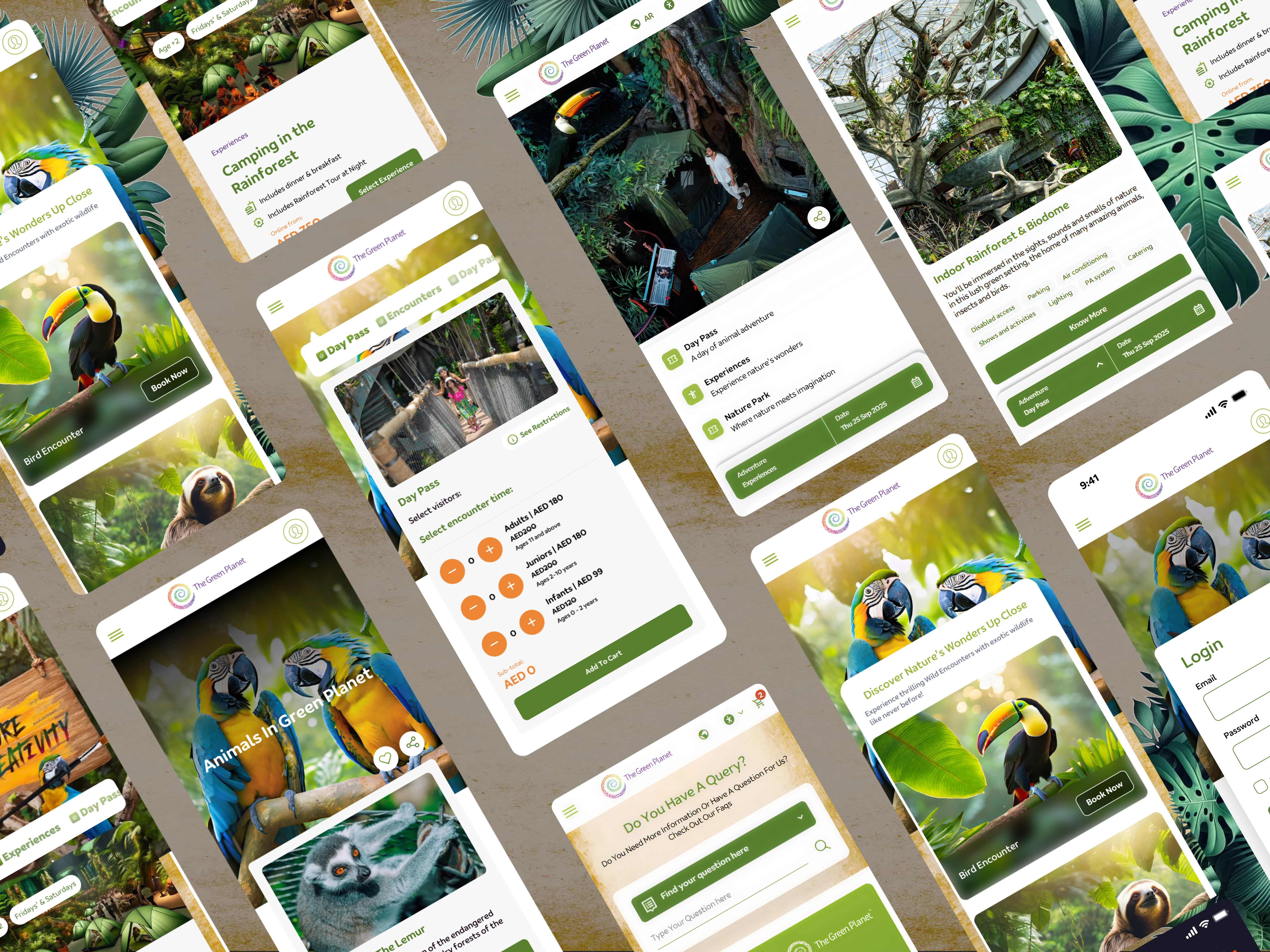
The Green Planet’s previous website presented users with an outdated and inconsistent digital experience. The interface relied on old-fashioned card layouts, excessive white space, and limited visual storytelling, which failed to reflect the immersive rainforest experience offered on-site.
Navigation lacked clarity, and the ticketing and information sections were not optimized for engagement, making it harder for visitors to explore offerings or make quick booking decisions.
It lacked a modernized, visually rich, and user-friendly platform which we started doing.
The Green Planet’s previous website presented users with an outdated and inconsistent digital experience. The interface relied on old-fashioned card layouts, excessive white space, and limited visual storytelling, which failed to reflect the immersive rainforest experience offered on-site. Navigation lacked clarity, and the ticketing and information sections were not optimized for engagement, making it harder for visitors to explore offerings or make quick booking decisions. It lacked a modernized, visually rich, and user-friendly platform which we started doing.
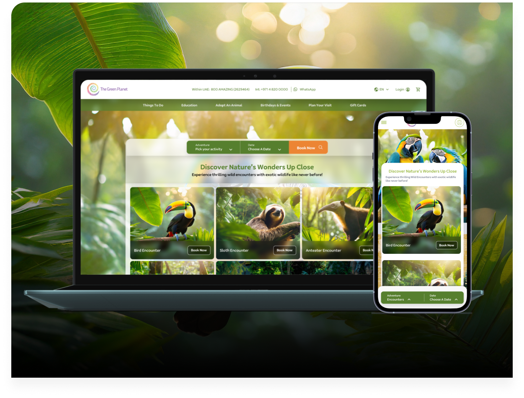
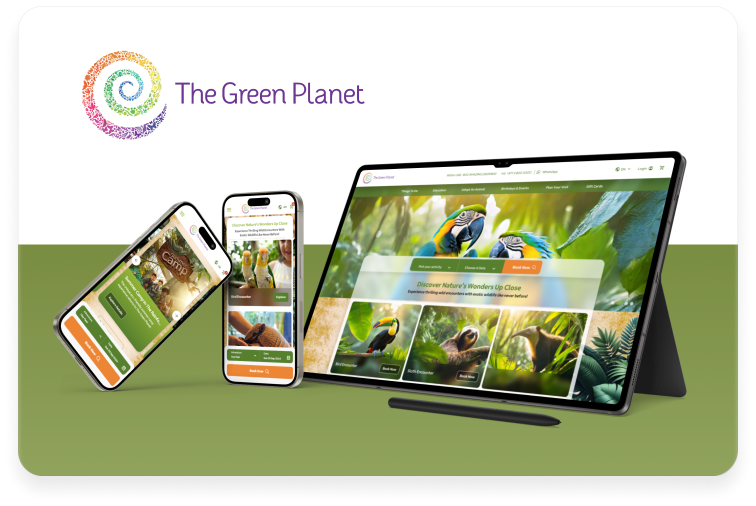
I led the UX/UI redesign of The Green Planet website with the goal of creating a more immersive, nature-first experience while reducing booking friction. The new design introduced a nature-driven visual language, clearer information architecture, and subtle micro-animations to enhance storytelling in addition to streamlined booking CTAs, clearer festival & events discovery, improved mobile-first layout that increased the mobile traffic share to 80%